Brand Identity & Package Design
UI/UX Design Intern at
McCANN Health
I created an IP character representing "啵肌“ to signify both the gummies and the relaxing and cheering image our campaign attempting to convey
project 1
Nestle Cheetos
Cheetos in China collaborates with a Chinese animation Fox Spirit Matchmaker 狐妖小红娘 to launch their products. In order to promote this collaboration, our team establish campaigns on WeChat platforms that involves lotteries and games to approach to both parties' fans as well as non-fans by offering them gifts and benefits from playing
the games.
duration
June - August 2021
client
Nestle Cheetos
my role
prototyping
interface design
team
Vera W (Creative Director)
Jeling W (Art Director)
Strategy Team

distribute a playful experience on various Chinese social platforms to approach to different groups of audiences
same logic but in the style of Fox Spirit Matchmaker (狐妖小红娘 ).

entry page
Have a QR code for users to scan in order to have. a chance of receiving awards. The QR code lead people to repost this link to their moments and collect likes from their friends

DIY poster
Automatically generates a personal poster for the participants to share.
rules intro
introducing the lottery's rules and regulations


lottery page
having different tickets at different price for the lottery

ranking
Participants can see their rankings comparing to their friends' lottery.

collaboration page
project 2
A Drop Of Possibilities
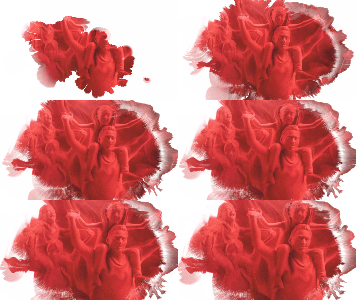
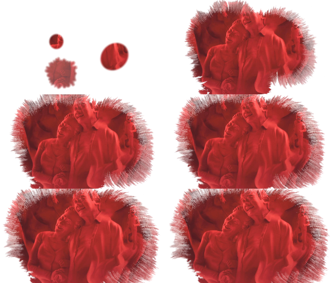
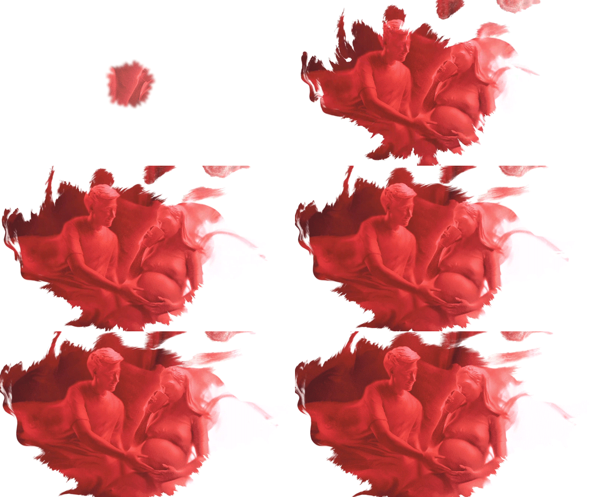
The Shanghai Blood Administration Center experienced a sufficient shortage of blood. In order to encourage more people to participate in blood donation, our team created the creative concept of A Drop of Possibilities through a series of motion graphics (让一滴血做的更多). We highlighted and communicated the infinite possibility of a single drop of blood with 3D models and animations. I was responsible for the animation design for gifs that is distributed in the social media platforms.
duration
June 2021
client
Shanghai Blood Administration Center
my role
animation design
team
Samson D (Creative Director)
Strategy Team


project 1
Vital Proteins
In today's society, we are tackled with all kinds of stress. Yet, something people often ignore is that while we have our mental stress, our skin also experience similar emotional arcs. When our skin are stressful, we lose collagen easily which creates problems for the skin. The campaign our team constructed for Vital Proteins aim to tackle that issue through the collagen gummies they just launched. We aim to create the image that the gummies could regulate the skin's feelings, cheer ing the them up by providing it with sufficient nutritions.
I was responsible for the key visual design, packaging design and IP character design to promote the brand's identy and make it more relatable to Gen-Z people, which is also my generation.
duration
June - July 2021
client
Vital Proteins
my role
key visual design
brand IP design
user research
prototyping
team
Samson D (Creative Director)
Jiajun S (Art Director)
Nathan Z (Senior Planner)
Strategy Team
mission
regulates the skin's emotion, cheering them up and tackle with stress
target audience
gen-z people
creative solution
construct a unique brand cue that is playful, memorable and relatable to gen-z people's daily life
brand cue
啵肌, an imitative of the sound representing:
- gummies burst inside the mouth
- people kissing their skins
- love, happiness and relaxation

brand IP


For the packaing, we also want to make it relates to the bursting effect of gummies inside the mouth.
packaging
by doing focus group research on Gen-Z people, we discovered that people prefer the gummies that has a sandwich layer with bursting juice, which helps them destress. Thus for the brand-identity, we also want to relate to that bursting and juicy aspect.


other brand campaigns
I also created prototypes for other brand campaigns. On the left it shows the prototype of a pop-up vending machine we want to construct that help people check with their skin-emotion condition and provides solutions. On the left is a demo of music video our team attempt to create to make the slogan and product more relatable and memorable for the target audience.
focus group research
According to the user research, we noticed that most Gen-Z people prefer the “甜酷” vibe, which is a style that blurs the boundary between being cute and being cool. Furthermore, we also tested on their preference regarding different types of gummies, the different styles of packaging and slogans.


key visual prototype
For the kv prototype I established, relating back to the results from our focus group research and from our strategy team's concepts, I aim to maximize that image through the model and the elements while also preserving the juicy aspect of the gummies.


